Thursday 26 January 2012

Yoo Inspired by Starck: Gramercy

     Yoo inspired by Starck - www.yoo.com    


The interior design on this page is by Yoo Inspired by Starck. This property was available to purchase in one of New Yorks most desirable districts, Gramercy and it is simply stunning. The developer Victor Homes built 200 units and buyer were able to customise their interiors according to a selection of suitable palettes.

     Things I Love:    


  • The black and white colour scheme.
  • The long white curtains which create a feeling of luxury - this is how Iimagine it must be up in heaven with the angels.


     Things I Love:    

  • The ceiling art with the gorgeous black chandeliers.


Philippe Starck:La Co(o)rniche Hotel

     Philippe Starck www.starck.com     


This is the La Co(o)rniche hotel designed by Philippe Starck, it is situated in Pyla-Sur-Mer in France, Europe and opened in 2010.  


     Things I Love:    
  • The purity of the white colour pallet.
  • I actually really love the chrome that is featured in the bedroom (I thought I was a stainless steel girl, so I am quite surprised!)
  • I love the angle that the bed is positioned in the room and love the little desk/dressing table positioned behind the headboard. 
  • The panelled wall detailing I love, I especially love that the wall has been built out creating a small shelf area. I love that the panelling has been stopped short of the ceiling and that the large pictures are positioned at the lower height. 


     Things I Love:    

  • The wardrobes are stunning, I love the colour of the textured glass, it is so subtle but creates a stunning visual effect against the pure white pallet.
  • The opening into the bathroom, showing the gorgeous freestanding bath looks amazing, my favourite part about the bathroom is large, simple mirror positioned behind the bath - gorgeous!
  • I really like the mat or carpeting that is used in the hallway below, I love the story that appears to be written.


Monday 23 January 2012

Philippe Starck: Palazzina Grassi Hotel Venice

     Philippe Starck www.starck.com    


This hotel - Palazzina Grassi Venice was the first hotel designed by Philippe Starck in Italy. This hotel was opened in 2009 and is described on the website by the use of the following words: dream, poetry, romanticism and traditional.


Things I Love:
  • The mirrored furniture creates a romantic effect which in this case I think works very well. 
  • The simplicity of the room with the all white colour scheme.
  • The small discreet side lamps with the black masks motif.
  • The large mirror used as a headboard
  • The frosted covering over the window in the bathroom which has been detailed with the masquerade ball masks. A simple yet effective touch.


Philippe Starck: SLS Hotel Beverly Hills

     Philippe Starck www.starck.com     


The SLS Hotel Beverly Hills is the first "true' luxury hotel that Philippe Starck designed in North America. The hotel opened in 2008 and his innovations for SLS have been designed to surprise, soothe, excite and enchant.


    Things I Love:  
  • The zones that have been created through the use of luxury curtains.
  •  The mix of very different types of furniture, the mix of old traditional style furniture with bold painted furniture.


    Things I Love:  

  • The beautiful glass cake stands and vases. I love the effect they create with the amazing colurs shining through the glass and the reflections that the lights create.
  • The white candelabra with matching draped beads. 
  • The mirror reflecting light above the work area.


    Things I Love:  
  • The sculptural effect that is created by the plant pots. The plant pots all seem to have the same type of bush but the varying heights and styles of the plant pots really stand out creating an exciting entrance.


    Things I Love:  
  • The large scale picture frames that border the swimming pool. This is a great idea each frame captures a section of the landscape creating real life paintings. I love the varying scales and styles of the frame and I love the effect that is created in the evening when the lights shine down onto the frames.  


Thursday 12 January 2012

LUXURY PINK AND YELLOW BEDROOMS

     THE MAYFAIR HOTEL LONDON - www.mayfairsuites.com     

THE SHIAPARELLI SUITE (image via www.mayfairsuites.com)
THE AMARILLO SUITE (image via www.mayfairsuites.com)
The bedroom suites above are from the swanky Mayfair Hotel in London.

The Shiaparelli Suite is described on the hotels website as being: "Named after the designer who first unleashed fuschia on a glamour-starved world, the Schiaparelli Suite is a loving tribute to retro glamour, designed and furnished with wity style." The flamboyant yet sophisticated style of the Schiaparelli room also makes the suite one of London's most sought after film locations adding glamour to any celebrity line-up.

Things I Love:
  • The pink pony skin and leather, the ornate detailing and luxury fabrics. 
  • The stunning bedside lamps.

The Amarillo Suite is described on the website as: "Casting a spell at every turn, the sophisticated spaces of the Amarillo draw guests into a world of cool luxury in the heart of London."

Things I Love:

  • The yellow pony skin and leather, the smoothed stone and luxury carpeting cut into the stone flooring.

A Bedroom on Wheels

     www.ducotedechezvous.com     


This loft apartment contains what I think one of the most genius ideas ever! This bright fun cube on wheels contains a bed and can be rotated to fit into the space to suit the needs and desires of the user. e.g if the user requires more privacy they would position the large opening to the wall.  As you will see below the cube wall also serves as a project screen to watch movies in bed - it really couldn't get any better!


Things I Love: 

  • The whole concept! It is very very clever indeed
  • The simplicity of the concept this would be easy to replicate
  • The bold bright pink colour on the outside of the bed mixed with touches of orange, these colours mix beautifully with the dark wood floor and white walls.
  • The glamorous chandelier and Stark inspired ghost chair.


    Source: www.ducotedechezvous.com

    Bulthaup Kitchen Island with Integrated Glass Showcase

         Bulthaup www.bulthaup.com     


    This is kitchen display in the Bulthaup showroom in Via Durini 17, Milan. 

     Things I Love: 
    • The glass showcase box is amazing!!
    • The lighting that is incorporated into the glass box is stunning.
    • The all black kitchen with its sleek lines and black chimney extractor.
    • The thought of the glass showcase being a fish tank!


    Source: www.bulthaup.com


    Monday 9 January 2012

    Loft Style Living - Trevor Nelsons Pad

         Ambience Contracts - www.ambiencecontracts.co.uk     


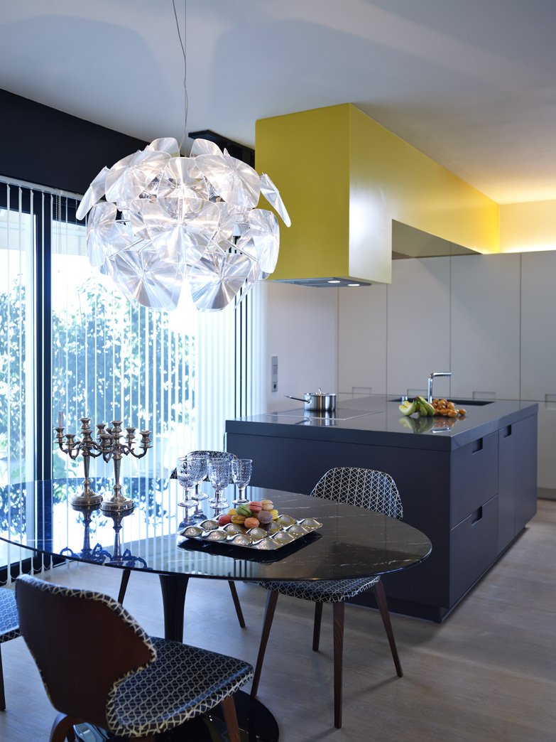
    Source: www.ambiencecontracts.co.uk
    Trevor Nelson the cool smooth radio DJ contracted Ambience Contracts to undertake the renovation of his Loft Style Home. This is what Ambience Contracts say about the project on their website:

     "The loft style apartment had not been altered since it's basic conversion from a spice warehouse 15 years ago. There was no storage and it was completely open plan with no bedrooms as such. Rather than intrude on the double height space with solid walls, we used glass walls instead, with luxurious curtains for privacy. The bespoke joinery was designed to accommodate the clients specific requirements. A huge roll out canvas with a personal image, hides the plasma TV. The project was carried out in phases and included rewiring, new bathroom, space zoning, bespoke joinery and kitchen, a new conservatory room and a terrace'

    Ideas I love:

    • The different textures, the brick wall, the use of glass in the kitchen & upstairs in the bedroom windows.
    • The lighting in the kitchen area, the under cabinet lighting sets off the purple glass splashback and the lighting directed onto the wall units above the splashback have been cleverly directed to create light and shadow allow the wall units above, below and to the left and right of the purple glass splashback to create a frame.
    • The large glass windows looking down from the bedrooms over the main kitchen living area and the two large windows that look over the spiral staircase, they are extremely effective creating light and interest (the only downside is that you would have to make sure your bedroom was always tidy becuase it is going to be on show) I also love the idea of having luxurious curtains to be able to pull over to close the windows off.
    • The low floating shelf that runs along the length of the brick wall but I especially like the section where there are higher units with the freestanding light.
    • I also love the large framed picture with the 3 smaller picture at low level just above the floating shelf.


    Tailored Precision Victorian Townhouse

         Mazen Studios  - www.mazenstudios.ca    


    This is the home of interior designer Mazen El-Abdallah of Toronto's Mazen Studio. He redesigned his Victorian home to feel more like a modern, open-concept loft. Whilst I watched the video tour of his home on the House and Home website he chatted about some simple but effective ideas he introduced into his home, these ideas I found to be great  design ideas that I found very interesting which are detailed below:

         Ideas and Design Thoughts I Love     
    • The living room had furniture with legs to raise the furniture up off of the floor which creates a more open space.


         Ideas and Design Thoughts I Love     
    •  6ft x 9ft mirror in the entracne hallway which opens up and reflects the space.
    • The living room and vestibule/entrance hall are open plan so instead of having to put up a partition to separate the different areas he opted for fitting a different floor covering in the entrance hall area which I think works very well.


         Ideas and Design Thoughts I Love     
    • In the kitchen he painted a square shaker style kitchen door to black and didn't add any handles this allowed him to create a modern, contemporary kitchen with a traditional twist. 
    • The master bedroom is very simple and features wall mounted lamps which can be pulled over the bed when reading at night but also look quirky because they are not standard lamps sitting on a bedside table.


    Source: www.mazenstudio.ca


         Ideas and Design Thoughts I Love     

    This area above is Mazens day room, instead of having a second bedroom he knocked down the wall and opened the space to create a hall landing. 
    • I love the detail at the sideboard, I love the large square mirror being offset with the two smaller square pictures below. I love how the mirror reflects the two doors below on the sideboard and the pictures reflect the drawers in the sideboard. 

    Friday 6 January 2012

    DUPLEX APARTMENT IN ATHENS WITH ORANGE KITCHEN & FAB BLACK STRIP LIGHTS

         SPACELAB ARCHITECTURE - www.spacelb.gr (via www.contemporist.com)   


    Things I Love:


    • The contrast between the orange worksurface and the bank of tall black housing units. The contrast makes both areas stand out.
    • the black strip lights running down both sides of the island.
    • I love the texture of the cylindrical island extractor it looks like a brushed steel which I think works very well against the matt black housing units. 
    • The wallpaper which looks like newspaper print.


    Things I Love:

    • The variation of colour used for each drawer in the vanity unit, but I also love that the drawers are not all flush and that there is a bit of movement in the position that they sit, it creates a lovely effect against the smooth sllek lines that are created by the large grey floor and wall tiles. 
    • The chunky white worktop with the square edge profile.
    • The simple sleek mirror which runs not only at the sink area but right over the bath, the lighting below the mirror makes the mirror appear to be floating.  


    This is a small kitchenette which is in this apartment.

     Things I Love:


    • The sleek handleless lines of the white units.
    • The yellow worktop with matching splashback and moulded sink in the same yellow colour.
    • The thin frame fitted around the kitchenette, which works well with the ceiling detail and overhead lighting.


    Source: All images are via www.contemporist.com

     Things I Love:

    • The sink/vanity unit is stunning. I love the colour of the worksurface mixed with the rich dark woods and the cool great tiles.
    • The worksurface has been designed with a moulded sink in the same colour which continues the streamlined look instead of breaking it up with a white sink bowl. 
    • The way that the worksurface has been fitted with the wood panelling not sitting below the bottom of the worktop like a standard worksurface would sit, it has been brought right up to sit flush with the top of the worksurface which I have never seen before but I think it looks great. 

    ATHENS APARTMENT WITH QUIRKY YELLOW KITCHEN EXTRACTOR

         SPACELAB ARCHITECTURE - www.spacelb.gr   (via www.contemporist.com)  


    Things I Love
    • The block colours - the charcoal grey island units with matching worksurface colour.
    • The cleverly designed feature extractor finished in yellow. (what a statement)
    • The charcoal and yellow together with the back drop of the tall white housing units.
    • The very traditional styled rug mixed with the ultra contemporary kitchen and colour mix.


    Source: Via www.contemporist.com

    Things I Love

    • The colours and textures in this bathroom. I love the mix of brick with the clean flat lines of the white shower tray.
    • The grey worksurface mixed with the dark rich wood units below.
    • The idea that the worksurface and mirrors right along into the shower cubical.
    • The underlighting and over ligthing beaming from the mirror.