Wednesday, 30 March 2011
Split Colour Shelved Island:Kitchen
The shelved area in this kitchen island really stands out due to the contrast in colour used in the drawers below. I am also drawn to the balance between the shelved area with the feature mirrored extractor above, it is very important to create the perfect balance in a kitchen where possible.
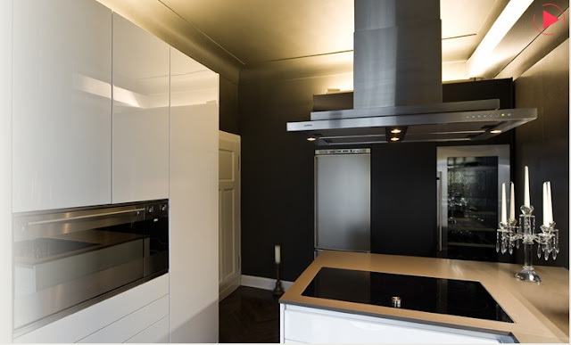
Dramatic Black Walls in a Small Kitchen
The black walls in this kitchen add so much drama to the room, which I love. What I love more is the fact that this kitchen is not fitted in a massive room with lots and lots of light. The black walls are probably something that most people would be scared to do but I think this kitchen is a perfect example of how dark walls can really enhance a kitchen.
White Feature Extractor Kitchen
Feature extractor built into a block bulk head, proportioned perfectly for this kitchen and still high enough to be away from head height.
Star Light Bathroom
 |
| Source: www.boffi-koeln.de |
This bathroom is minimalist but the small features that have been added into the bathroom just transform it one step to being quirky. The back wall of this bathroom is gorgeous with the little splashes of colour added in the perfume bottles. The lighting (as always) provides a stunning feature, I imagine at night this room would just look amazing. The shelf at the front of the bathroom is in my opinion a genius idea! I have never seen this done before but think it could work for everyone and the fact that you can personalise the bathroom by adding different pictures as and when you feel without having to worry about holes in tiles or holes in wall makes it even more favorable in my eyes.
Boffi Koeln Pink and White Kitchen
This is another great example of how to add spot colour into a very neutral colour pallet in the kitchen without being committed to the colour in the kitchen units. There are lots of quirky features in this kitchen, the mixture of stainless steel and Corian worktops, the differing thickness of worktop. The tall units which are part recessed into the wall but have a small recess at the top of the them to allow feature lighting works as a subtle but effective addition.
Number One Grosvenor Crescent, Edinburgh
A stunning property mixing traditional features with contemporary finishes. My eye is particularly drawn to the amazing stripy blinds. they really emphasis the scale of the windows because they are such a feature. The little zones that have been created for lounging, dining and cooking work well together.
Monday, 21 March 2011
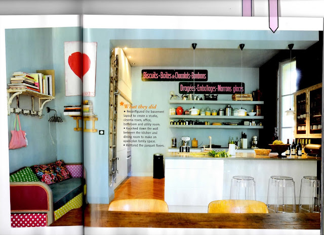
Biscuits*Boites*Chocolats*Bonbons
This kitchen is full of quirky features. What my eye was drawn to was the wall colour with the pink writing against the back wall. These colours always work so beautifully together in my eyes.
Other points of interested: The rustic glass wall unit positioned at the end of the island. The chunky full length shelfs painted in the same colour as the wall. The rustic ladder (to reach the kitchen units going up to the ceiling)placed against the wall, normally people would hide this in their garage but it is a very unique addition that adds to the eclectic feeling of the whole space.
Bathroom Spot Colour
I love the spot color used in the sink base unit, the pastel colour looks fab against the black. The rubber dotted material is very interesting being used on such a grand scale as I have only ever seen it being used a floor but I think it looks great. I also like the height that the black rubber material finishes. It doesn;t go right to the ceiling which in this case works really well.
Photo Framing
This simple way of combining framed photos looks great, it is nice how there are also some empty frames ready and waiting for that special memory to be saved.
Red Lights*Yellow Stools
Source: Apartment Therapy, Roy & Liane's Design-Build Home
Red lights and yellow stools - the perfect way to add colour into a kitchen without commiting the colour to the units.
Friday, 18 March 2011
Black and White Stripes
Things I Love:
- The black and white curtains,
- The colourful photo montage, love the randomness of this next to the very precise stipey curtains.
- The dark floor combined with the white furniture.
The Amazing Blue Wall Units
6 Things I love:
- The height and proportion of the blue wall units, the colour of the blue wall units.
- The contrast between the matt blue wall units and the glass splashback.
- The castors that have been fitted to the island unit, very practical if you have the space ans strength to move it!
- How the flooring, the base units, the worktop, the wall paint and the units to the right of the picture just blend together allowing the main focal point to be the blue wall units.
- How your eye is drawn up to the wall units then up further to the stunning cornicing which stands out as a beautiful feature against the ultra contemporary lines of the units below.
- The change in texture picked in the worktops al;though the colour is still neutral the slight texture through it adds another element.
Subscribe to:
Comments (Atom)


